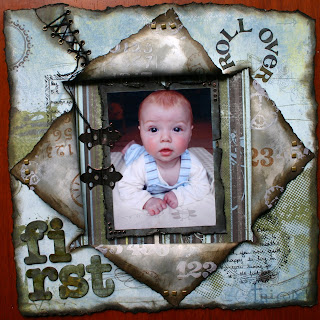
You know the scene from when Harry met Sally..... well..these are one of those!!! Oh Yes..Oh Yes!!!!!!!! PRIMA JOURNELLING STAMPS!!!! I so wanted these for what feels like forever!! But as Sue said they were worth the wait!!
I have used them in the corners of this LO.
The paper has been ripped and inked and the insides turned over and stamped with Gesso before applying distress inks and stamping on top. The numbers represent the stages of learning how to crawl and then walk and the clocks how quickly time flies when you have a new baby!
Detail of eyelets
K& Co chipboard alphas have never looked like this before, they WERE extremely cute!
I bet Brenda Walton the designer would have kittens if she saw them this colour!!
I stepped out of the box a bit and tore all around this Lo it is very asymetrical, but now I am wondering whether I should get back in the box and mount it on Black cardstock after all? I could really do with some serious opinions on this one!!
With a Black Cardstock Mount????
Without...........?????????
Please if you visit this Blog leave me a comment I really do value other peoples opinions (and it's not very often I ask for those!! LOL!!) xxx
Monday, 7 July 2008
Subscribe to:
Post Comments (Atom)


10 comments:
OOh this is a tough one, as I like both pages, why don't you do another layout the same, have one with and one without, lol
Personally I think the one with the black frame makes the cute photo pop more and show off the fantastic work a bit more too!!!
Well that is my opinion and I am sticking to it, lol!!!
xxxx
Wow! I just adore this page!!! I just recently found your blog on another blogs site (maybe inspirational) and subbed it with bloglines...
I like the page with the black background, but thats me! its awesome either way!
Thanks for sharing!
Well, to is- quote the lady in the film "I'll have some of what you're having" because this is just ONE STUNNING PIECE - I can't find words to describe how tight and well composed it is and the effects of all that tearing, inking and gesso-ing is totally perfect! I love everything about it - you've excelled yourself.
I'd love to buy those stamps now but I know they wouldn't transform anything I made to this standard - give yourself a BIG STAR!
XXXXXXXXXXXXXX
PS, re with or without, with (marginally) but I'd love to have created either version.
xxxxxx
Your work is amazing! Glad I found you! I would go for the black background, makes the photo pop out I think, and finishes the dramatIc look of it all in a perfewct waY!
I prefer the black. I think it adds the dimension to the page.
WOW!! This is gorgeous, STAY OUT OF THE BOX!!! It works for you! I like the black, it makes the details pop out! And makes it more dramatic!!! Thanks for visiting my blog and leaving love!!!
Oops, I misread what you said by getting out of the box. That's what happens when you squeeze in blog reading while working. I love,love this. I have a 13 month old and can relate to time flying by, they grow wayyy too fast! Anyway I like the black, it shows your torn edges off! Oh and thanks for the info on crackle paint, I should've know it would be something Tim Holtz is in to!!! Thanks again....
Wow! I can not get over the details... amazing. Me, I like it best with the black - I think it allows for more depth & richness. Gorgeous LO either way though.
WOW Ruth this page is just fabulous, I love it on either colour background. I love the way you've combined everything, but my favourite thing is the stamping with gesso - a fantastic page all round xxxx
Post a Comment